Capital Font Review: A Handwritten Script for Campaign Designers
It was forty minutes before the product teaser needed to go live. I had the visual locked, the color palette approved, and the call-to-action button placed. Everything felt polished. Then I zoomed into the mobile preview and froze. The headline, set in a clean sans serif font, looked cold. It communicated the information but none of the energy the brand needed. I swapped the title into a different typeface, and the whole graphic opened up. That font was Capital, and it turned a forgettable announcement into something people actually paused to read.
That is the kind of moment where a handwritten font like Capital proves its value. It is not just decorative. When placed deliberately, it changes how an audience feels about what they see. For marketing designers and social media strategists working under tight timelines, Capital offers a blend of charm and readability that is harder to find than most font libraries suggest.
What Capital Brings to the Layout
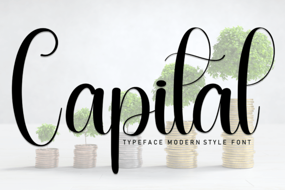
Capital is a sweet and friendly handwritten font. The letterforms carry a natural bounce, with rounded strokes and a casual rhythm that feels hand-drawn rather than mechanically perfect. It belongs in the Script Amp collection under Fonts, and it fits comfortably in the space between a polished script and a loose personal note. The personality is warm, approachable, and confident without trying too hard.
When I tested Capital inside a campaign layout, the first thing I noticed was how well it held its shape at display sizes. The strokes are thick enough to carry weight without becoming muddy. The spacing between letters stays open, which helps the words breathe even when stacked vertically. That matters for social media graphics, where a headline often competes with background texture, overlays, and brand elements.
For marketers who build Instagram posts, Pinterest pins, or YouTube thumbnails, the first impression happens fast. Capital delivers a friendly tone immediately. It does not look like a corporate script or a formal calligraphy style. It looks like someone wrote it with intention, which aligns well with campaign themes around community, celebration, and personal connection.
Real Campaign Test: Product Teaser and Sale Announcement
I used Capital in a product teaser for a limited-run drop. The headline sat on a soft pastel background with a single product silhouette. In a standard bold sans serif, the graphic felt like a utility notice. Once I replaced the headline with a Capital wordmark treatment, the mood shifted. The typeface added a sense of occasion. It looked like a handwritten invite rather than a mass broadcast.
For a sale announcement graphic, I paired Capital with a clean sans serif for the fine print and the discount percentage. The combination worked because Capital handled the emotional load while the supporting font carried the details. The sale felt fun but still clear. That balance is hard to strike in promotional visuals, and Capital made it look natural.
I also tested it in an Instagram content series where each post featured a single quote or affirmation. Capital sat on top of layered photography and texture overlays. The legibility held up at standard feed sizes, and the friendly voice matched the series tone. On the first post, I noticed more saves and shares compared to previous quote posts that used a standard serif font. Correlation is not causation, but the visual difference was clear.
Where Capital Performs Best and Where It Struggles
Capital shines in short-form display applications. Think headlines, callouts, logo-style text, campaign labels, and decorative titles. It works well for sale announcements, product teasers, webinar banners, online course launch graphics, email headers, and branded template covers. The font carries a celebratory, lighthearted energy that suits event promotions, greeting card designs, and seasonal content.
Where Capital does not perform as well is in long copy, dense information blocks, or tiny text sizes. The handwritten style relies on a certain amount of visual breathing room. When you shrink it too small or pack it into a paragraph, the friendly shapes start to blur, and readability drops. For body copy, terms and conditions, or formal corporate communication, keep Capital out of the layout. It is a display font first and a supporting typeface second.
I also recommend testing Capital on dark backgrounds carefully. The stroke contrast is generally solid, but on very dark or very busy backgrounds, the lighter parts of the letterforms can get lost. A subtle outline, drop shadow, or color lift helps maintain clarity. On light and pastel backgrounds, Capital reads beautifully with no extra treatment.
Readability and Visibility in the Scrolling Feed
Social media managers know that a post has less than two seconds to earn a pause. Capital supports that speed because the letterforms are distinct and the overall silhouette of each word feels organic. In mobile previews, where thumbnails shrink to a fraction of the screen, Capital retains its character. I checked it at thumbnail size for a YouTube video, and the title was still recognizable.
For fast-scrolling feeds like Instagram Stories or TikTok covers, Capital works best as a single line or a short stacked headline. The open spacing prevents the letters from colliding at small sizes. If you need to add a secondary line of text, keep it short and let the font breathe with generous leading.
One practical tip I developed during testing: use Capital for the first word or phrase in a headline, then switch to a clean sans serif for the rest. This creates visual hierarchy while keeping the friendly hand-touched feel in the spot that draws the eye first.
Font Pairing and Building a Typography System
Capital pairs well with clean sans serif fonts like Montserrat, Open Sans, or Lato. The contrast between the handwritten warmth and the structured modern sans creates a balance that feels intentional. For a slightly more editorial look, pair Capital with a refined serif like Playfair Display or Cormorant Garamond. The serif adds sophistication while Capital keeps the layout grounded and human.
In a brand identity context, Capital works best as an accent voice rather than the primary typeface. Use it for hero headlines, campaign labels, or badge-style text. The supporting system can handle the menus, captions, and body copy. This approach keeps the brand consistent without overwhelming the audience with handwritten shapes across every touchpoint.
If you are designing a branded template pack for a small business, Capital can serve as the headline font across social media graphics, email banners, and Pinterest pins. Just make sure the client understands the font limitation regarding long-form content. Set clear guidelines about where Capital should appear and where the supporting font takes over.
Licensing, Formats, and What to Check Before You Use Capital
Before using Capital in any campaign, confirm the commercial licensing terms. Fonts from Script Amp in the Fonts category typically include standard licensing options, but always verify coverage for ad platforms, merchandise, client work, and digital products. If you plan to use Capital in a branded template pack or a client campaign, check whether the license covers redistribution or multi-user access.
Also check which file formats are included. Most premium font packages offer OTF and TTF files. Some include web font versions for site use. If you are embedding Capital in a landing page header or an email banner, a web font file can make the rendering cleaner across browsers. Without it, the browser may default to a fallback font that does not match the campaign look.
Look for alternates, ligatures, and stylistic sets in the font package. Handwritten fonts often include multiple versions of the same letter to keep the text feeling organic. When I tested Capital, I noticed that enabling ligatures smoothed out certain letter combinations and made the overall text flow more naturally. If your design software supports OpenType features, turn them on for the best results.
Multilingual support is another detail worth checking. If your campaign targets audiences in multiple languages, confirm that Capital covers the necessary accent characters and special letters. Nothing disrupts a campaign like a well-designed graphic with a missing character breaking the headline.
Final Practical Notes for Campaign Designers
Capital is not a font you set and forget. It needs the right background, the right size, and the right supporting type partner. But when those elements align, it delivers a friendly tone that plain system fonts cannot match. For marketing designers, social media strategists, and content creators who need to cut through a crowded feed without losing warmth, Capital is worth a serious look.
I keep it in my campaign toolkit now, not for every job, but for the moments when a layout needs a human touch. Whether it is a YouTube thumbnail, a Pinterest pin, a sale banner, or a product teaser, Capital brings a voice that feels like someone actually wrote it. And in a digital space full of automated perfection, that is a real advantage.